What I’ve Learned as a Designer at a Startup — Handall
How I opened my eyes to UI/UX when my internship had nothing to do with UI/UX design
tools — CAD, Adobe Illustrator, Adobe Photoshop, Adobe Indesign
Overview
During the Summer of 2020, I was hired in Seoul as a “design intern” at a Startup company called Handall. The job title “designer” is very broad, and my boss expected me to be capable in all aspects that arrayed from completing graphic & 3-D works to negotiating designs with other companies & factories.
Although I was drenched in exhaustion often staying late at the office, this was an opportunity for me to explore the diverse directions in the field of design. As a college student still in her year 19, I was willing to interact with any opportunity and go beyond my original boundaries.
About the Company
When I temporarily joined Handall as an intern, there were 5 employees including myself: my boss, an engineer, with 2 others managing accounting and marketing. Limited number of people at the office definitely formed us into a strong team. Even on rare days where we worked remote, our passionate working environment continued on virtually.
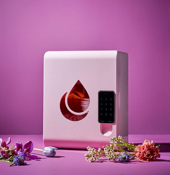
Handall is a corporation that implements mini lockers filled with menstrual products into restrooms of companies and schools. The intention behind equipping these products is to provide service and care for women at work places, and not have women spend additional fees on women products.
The system Handall thought of was to insert a locker with all sizes and types of women products into restrooms, with refill boxes delivered meanwhile.
Details of My Role
My role was to design the locker, refill boxes, and anything that had to do with bringing our campaign to life.


Over the span of 5 months, I designed the company’s business card, pamphlet, stickers, SNS content, and several other elements that contributed to constructing the company products. Lockers had to be 3-D modeled and rendered in order to be sent off to a molding factory. I also arranged photoshoots with professional photographers and communicated with several box factories and printing presses.
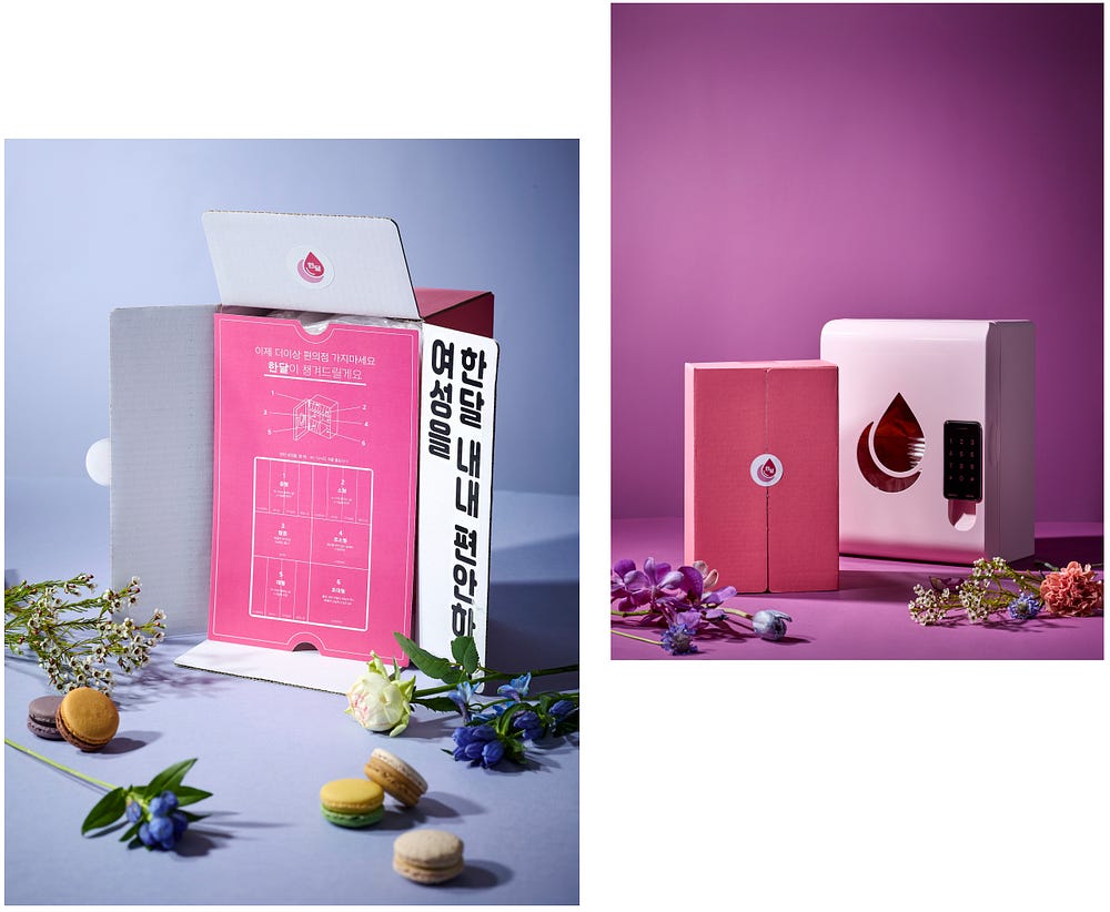
Through these experiences, I learned that branding does not only require creative designing skills, but also includes a ton of communicative skills and active energy. Any job would, but while I was expecting myself to sit in front of my computer screen for hours, I rather contributed in countless meetings, numerous phone calls, and had a great deal of sending files back and forth.
Moreover, the crux of my internship was during the process I designed the structure of the locker and the interior of the refill boxes.
How does this relate to UI/UX?
I am no designer nor student with UI/UX or product design experience at a workplace, but this internship definitely opened my eyes to the field.
In today’s world, people associate the word “product” to the app we use on screens. But since we all have the same initial goal of improving the users experience when using a certain product, I believe that the basis of a “product” roots from physical objects present around us. This is why my 5 month journey at Handall worked as a base for my UI/UX insight.
Thinking UI/UX at Work
I can’t explain the full and precise process of thinking UI/UX versus my internship, but these are brief correlations to parts of my design process.
User Research

When the first sample model of the locker was released, our team had a meeting to discuss what could be improved. Through hours and days of debating, we concluded that the corners were dangerously sharp, passcode was too shabby for users to press, and interior looked unorganized with mixed types of women products. We also held a survey, asking female workers to choose their preferences after implementing the sample for weeks.
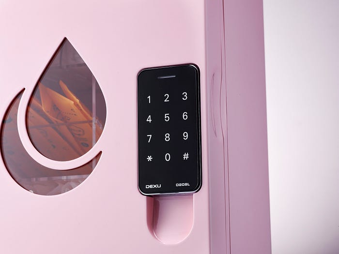
Therefore, our second sample model happens to be rounder and even has a modern touch passcode and mini hook under. We also organized the interior with clear acrylic columns. This progress shows my knowledge in identifying the people to problem, problem to solution, and design problem-solving.
The words above explains the user research. Discussing different opinions while thinking from the users perspectives, as well as collecting opinions from possible future consumers. I went through months of this.
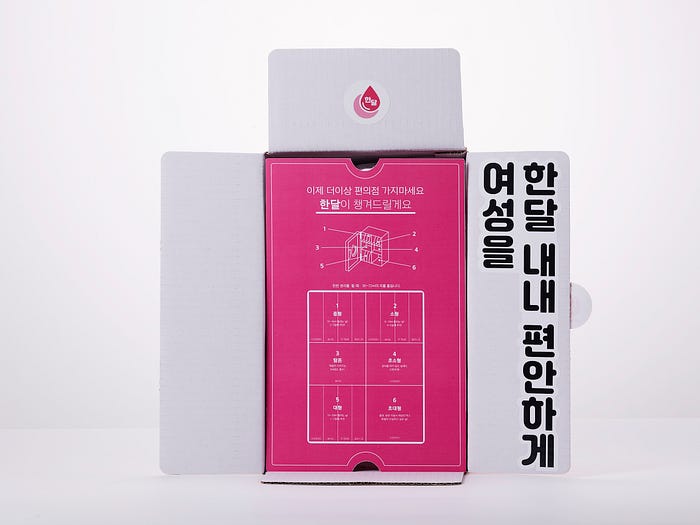
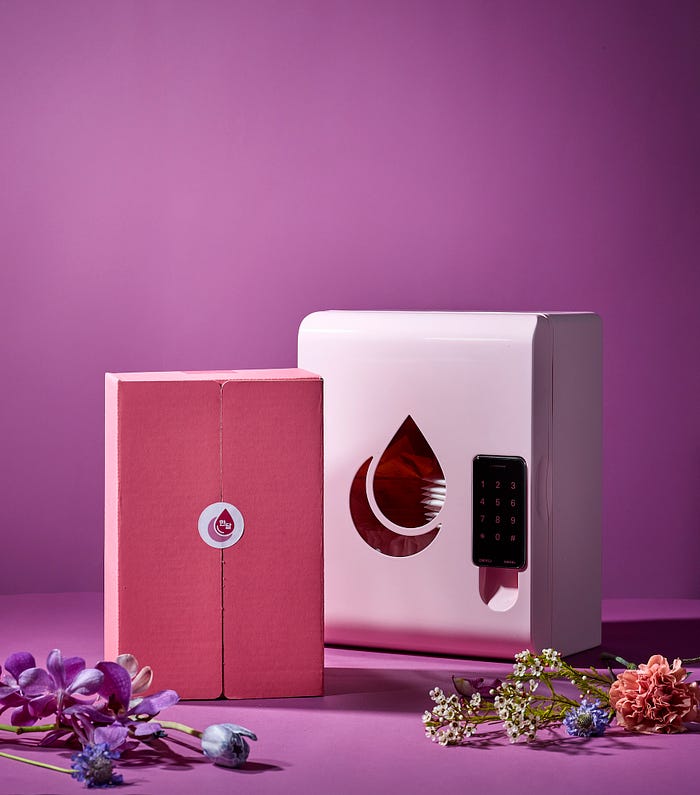
The same goes for the refill boxes. We experimented as if we were the customers. We played the actual scenarios during our meetings. For example, when the box is unwrapped, since the majority of our population are right-hand dominant, we purposely placed our slogan sticker on the right hand of the box assuming that people may subconsciously glance to the right first.
Also, the instruction poster that appears when you reveal the box has semi-holes to the top and bottom, so that it could be easier for users to lift. Though it may seem unimportant, I learned that these intricate details and studies of users comfort are what develops design into being more functional.
Market Research
At work, I was not only told to complete design tasks, but was told to do a lot of research. My boss believed that a proficient designer should be at an enlightened state with the project’s full identity. I was told to research similar or relatable companies. I did deep investigation on companies that were even located in different countries or in different branches. As I shared these during our meetings, I was complimented for my thoroughness.

Not only that I did my research on competitors, but when choosing a particular factory to stock our materials, for instance something that would wrap around women’s products inside the refill boxes, I was told to list down all options and present why I listed each option during meetings. I ultimately chose thin, eco-friendly zip lock bags as the best option because A. they are sustainable, B. they are protective enough to manage germs contacting women products during delivery. My boss was impressed with my thinking process, and this solution was proceeded.
Prototyping
It is once all the previous complex steps are completed, that I send over my 3D rendered designs to the factory and wait until they bring the physical outcome. Since feedbacks are constant, there were drafts for prototypes too. Outcomes that even develop from final feedbacks prove that the designs are truly user-centered.
What I learned
I know that I am not a professional designer, and I have a lot to learn. However, this valuable experience taught me a few things:
- Do not skip any steps
This may seem like an obvious statement, but design really is a process. Good designs don’t miraculously appear at your first shot. It took a series of trials and errors for me to discover and escalate to something greater, so it is crucial to be patient with steps.
2. Rely on other people’s opinions too, not just yours
I learned that what seems obvious to you may not be so obvious to the person next to you. I learned how different each individual’s minds function through attending our daily meetings. I also learned that ideas expand as they are critiqued and communicated with diverse people. Stay open-minded.
3. Consistency, consistency, consistency
Because I had numerous projects to handle as a designer, I was often lost track with sticking to a certain style guide. I was also under a limited budget when deciding certain materials for our products. This is why it is pivotal to conduct both internal and external consistency for users to more easily navigate.
If I had more time…
I self studied UI/UX once I completed my internship here at Handall. I gained more curiosity. I self directed various case studies and self-taught myself some tools through all the resources on Youtube or Linkedin.
If I was hired today as a student with more knowledge in User Experience, I would make further alternations to the locker’s passcode.
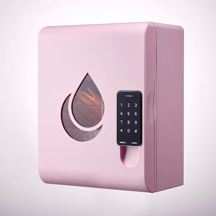
What if people not working at the company intrude the restrooms and take all the menstrual products? What if these intruders memorize the passcode?
To avoid intruders doing such act, I thought about making an app that has a camera and QR-code system, with the QR-code being located right where the passcode is as a replacement. With Handall’s newly built app, female workers could point their cameras to the code for the locker’s access.
Conclusion
This was a brief explanation of my 5 month journey at Handall. Because it was a startup and I was the only designer, I felt intimidated at first because I held so much responsibility. However, I am at the end rather extremely grateful for this opportunity, as I was able to distinguish my deep interests.
And although my internship was not a UI/UX focused position, I adopted the process during my practices. Starting from identifying the problem-solution, user research, market research, brainstorming solutions, countless meetings, final prototypes, making iterations, I experimented with Handall.
After all, I learned that the broad field of design unites with the intricate thinking process being the essential core of each alternation. I hope you enjoyed reading this! You can also reach me at: amandajh@usc.edu
